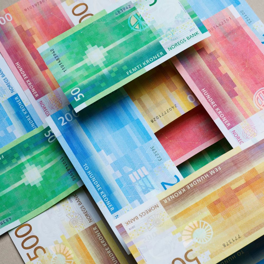
Maybe we are not using physical money daily anymore, but considering how much thought goes into it, most of us don’t appreciate banknotes enough. These newer Norwegian banknotes are a great example.
Norges Bank, the central bank of Norway, started circulating them in 2018. Their design is actually a combination of two different proposals: Their reverse side is from the design proposed by Snøhetta Design, and for the front side, the design candidate from Metric Design was used.
All the designs feature some sort of connection to nature, especially to the coastline of Norway and their deep connection to the sea. Every denomination has a theme that revolves around “The Sea”.
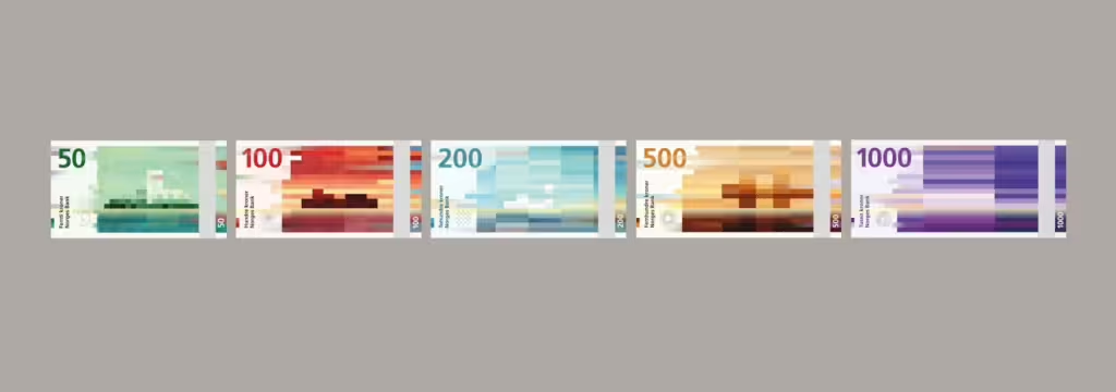
I am especially fond of the pixelated design by Snøhetta, done according to a reference to the Beaufort scale, which measures wind speed. Here is how they describe it:
The undulating waves and pixilated patterns of the note vary from each specific banknote design, whether a 50, 100, 200, 500 or 1000 kroner note, by referencing the Beaufort scale which measures wind speed. On the 50 kroner note the wind is gentle, represented by a dense cubic patterning and long, tame waves in a subtle organic wave pattern. On the other side of the scale, the 1 000 kroner note is characterized by a strong wind, expressed through long, pixelated cubes and short, choppy waves.
Snøhetta Design
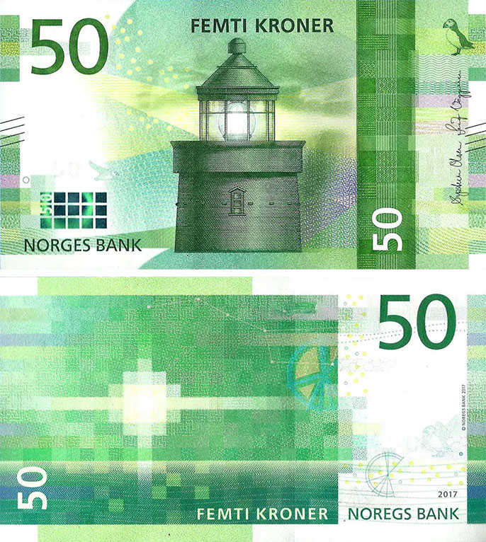
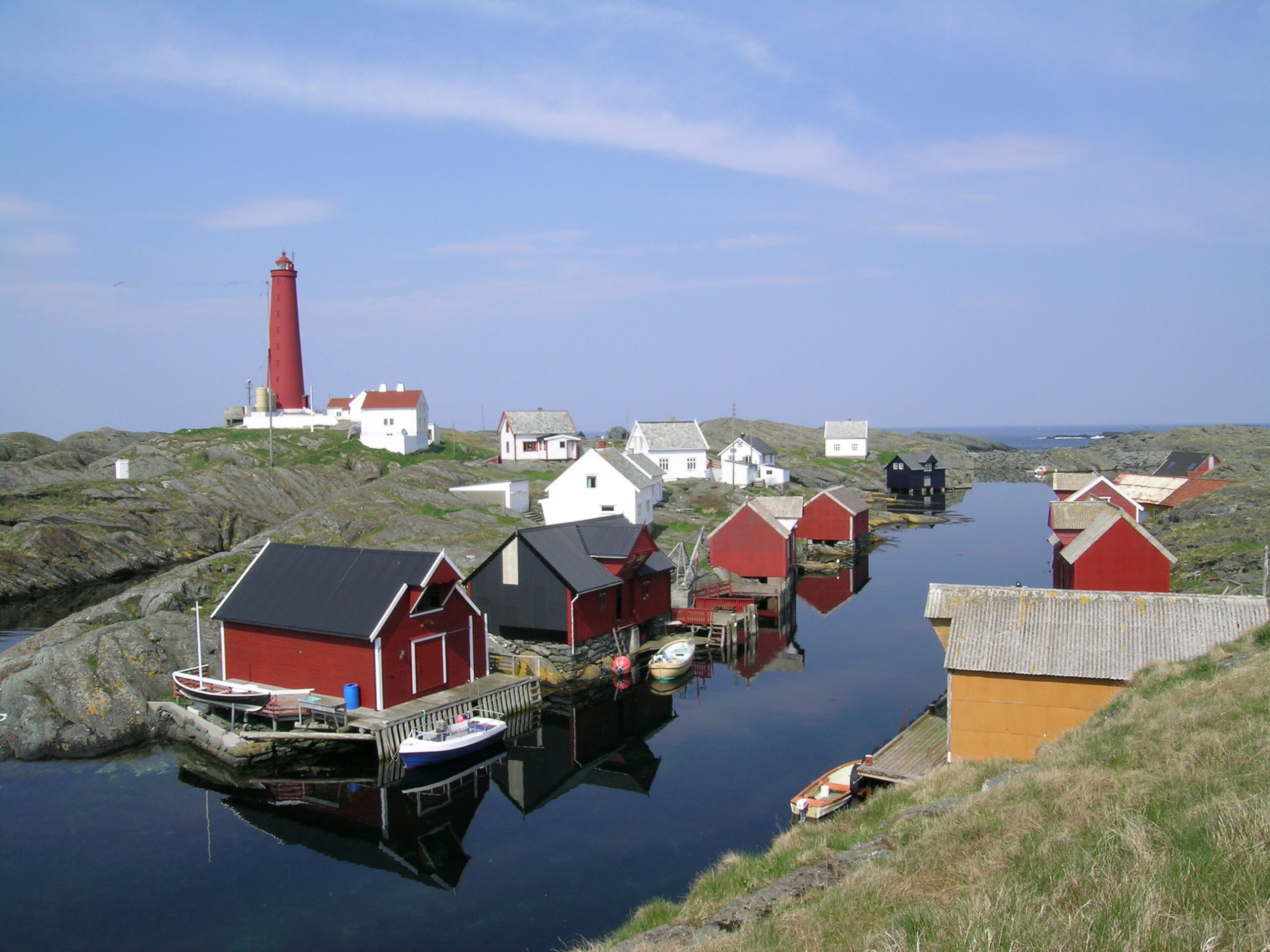
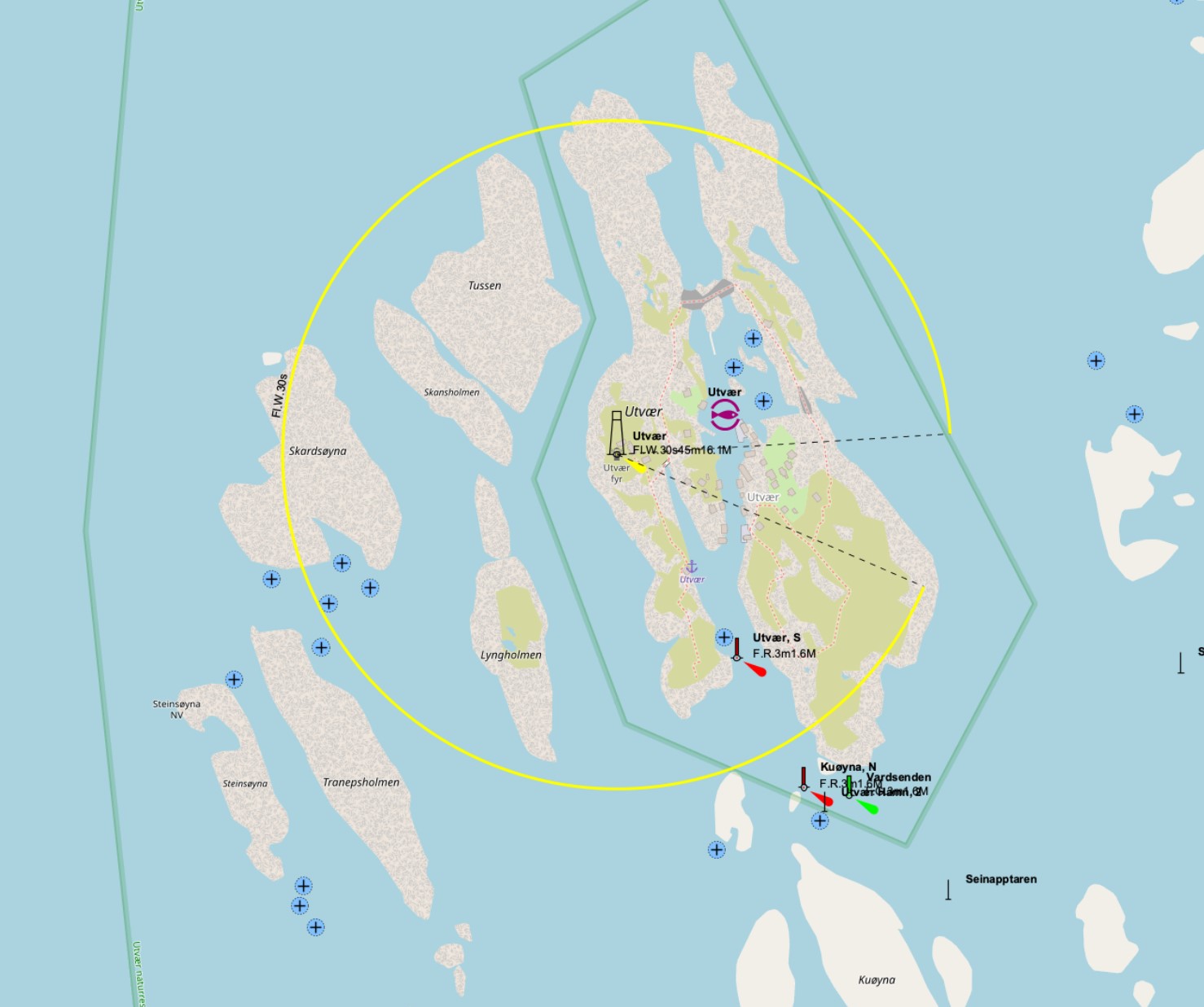
The 50-krone “The sea that binds us together” features a motif based on the Utvær Lighthouse, Norway’s westernmost point, on the obverse side. Many large lighthouses like this one were built along the Norwegian coast in the 19th century, serving as crucial navigational aids. The reverse side depicts a lighthouse’s light signal, the constellation Ursa Major, and a nautical chart symbol showing lighthouse light sectors.
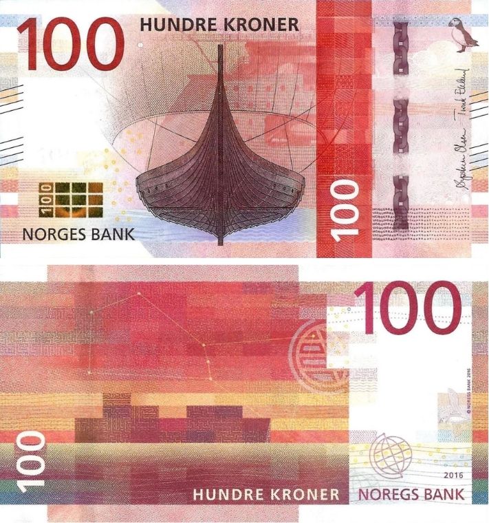
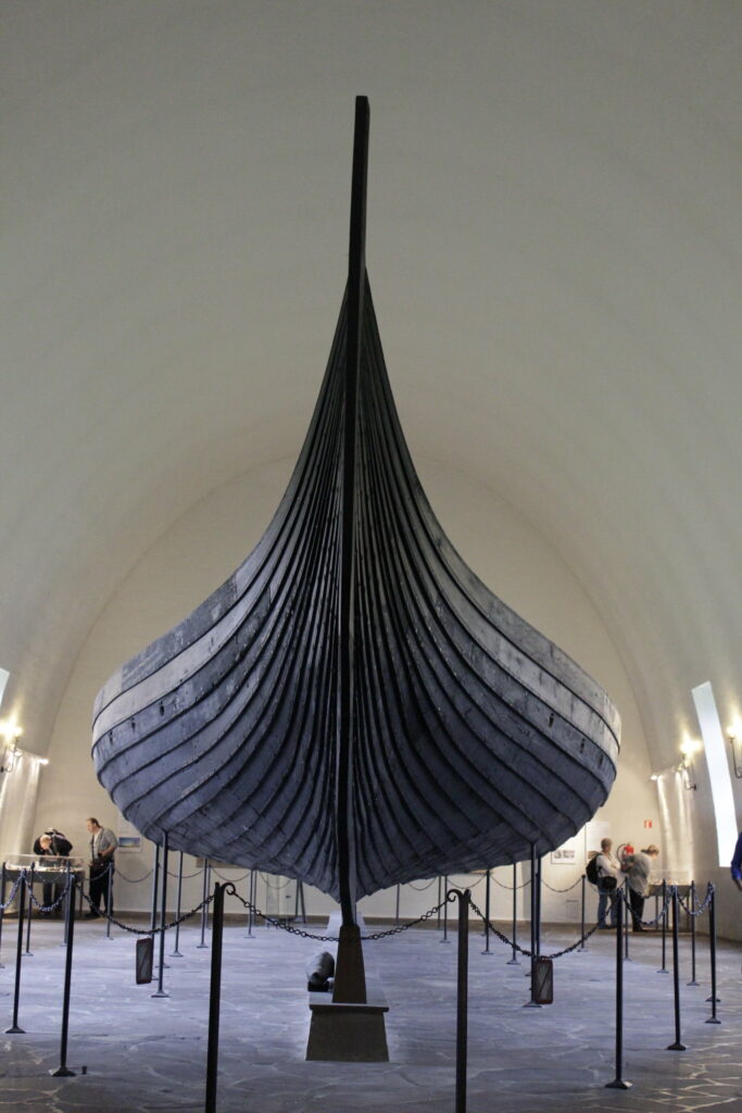
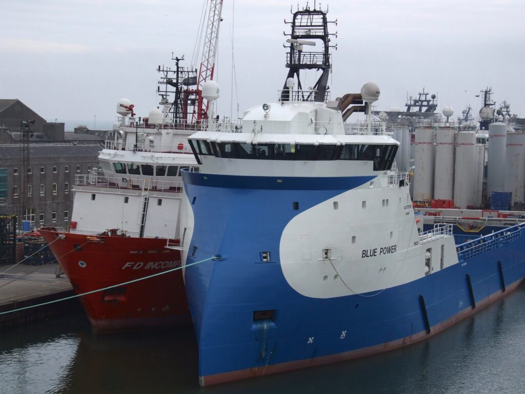
The 100-krone “The sea that takes us out into the world” features Norway’s largest preserved Viking ship, Gokstad, in the foreground. More vaguely in the background is X-BOW®, a more modern ship bow design. The use of these two together shows Norway’s drive to find better ways of moving on the water. The reverse side features a cargo ship and symbols of Norway’s reliance on shipping, including a globe and the constellation Orion. The rectangular shapes that are a little longer than the 50-krone suggest a gentle breeze.
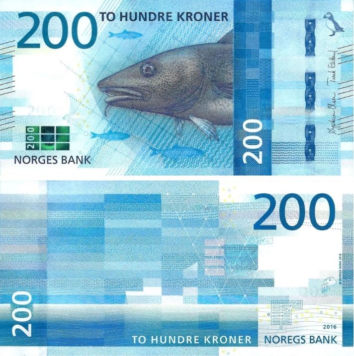
The 200-krone “The sea that feeds us”, you guessed it, revolves around fishing. The front side features a cod, as well as a fishing net and some herrings in the background. The reverse has a fishing boat in the distance, with the lines getting more rectangular with a stronger wind.
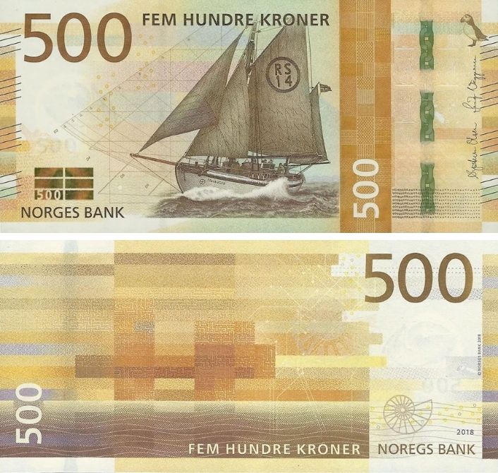
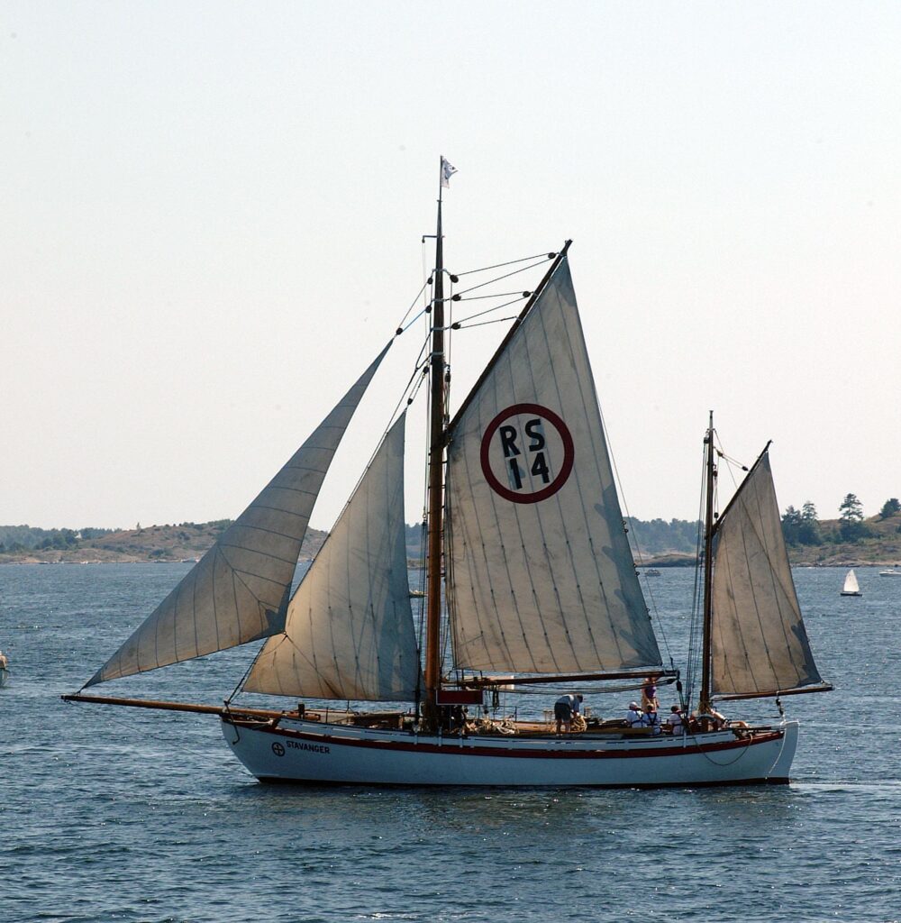
The 500-krone “The sea that gives us prosperity” features the rescue lifeboat RS 14 Stavanger in the front side. This boat was built by one of Norway’s best-known and iconic shipbuilders, Colin Archer. The reverse side depicts an oil platform, representing Norway’s offshore oil and gas industry, an important part of the Norwegian economy within the last 50 years. The banknote also includes stylized representations of the North Sea gas pipeline network and a fossil, in reference to Norway’s natural resources.
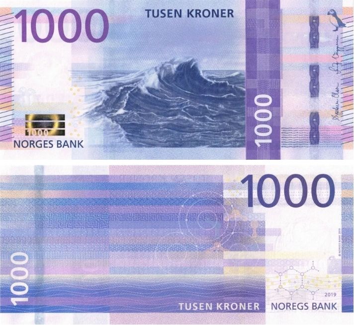
Finally, the 1000-krone “The sea that carries us forward” has a wave in the open sea as the primary feature on the front side. On the reverse side, the primary motif is also simply the open sea and waves, but this time, the long, rectangular lines represent a strong gale. We also see two representations of a water molecule, in liquid and solid states.
When traveling in Europe, it’s convenient to have the Euro, but this gives me one more thing to look forward to when I one day visit Norway. It’s also cool to see a government institution show so much care to go with a such well-thought-of and executed design while remaining connected to their identity.
You can find a short reading list below if you would like to explore these banknotes more:


